Usage Examples
This section provides a usage example of the piegy package.
piegy modules:from piegy import simulation, figures, videos
from piegy.data_tools import save, load
import matplotlib.pyplot as plt
Let us first define the parameters of our model: spatial dimension, payoff matrices, boundary conditions, etc.
N = 10                  # Number of rows
M = 10                  # Number of cols
maxtime = 100           # how long you want the model to run
record_itv = 0.1        # how often to record data.
sim_time = 1            # repeat simulation to reduce randomness
boundary = True         # boundary condition.

# initial population for the N x M patches.
init_popu = [[[200, 100] for _ in range(M)] for _ in range(N)]
# flattened payoff matrices
matrices = [[[-1, 4, 0, 2] for _ in range(M)] for _ in range(N)]
# patch parameters
patch_params = [[[1, 1, 10, 10, 0.001, 0.001] for _ in range(M)] for _ in range(N)]

# seed for random number generation
seed = 36
piegy.simulation.model object and run the simulation. Data generated during the simulation will be stored in sim.mod = simulation.model(N, M, maxtime, record_itv, sim_time, boundary, init_popu, matrices, patch_params, seed = seed)
simulation.run(mod)
This might take a while. You can see how much runtime it took after simulation is done.
Once the simulation completes, we can analyze the results with a wide range of tools provided by our piegy package. For example, use a simple curve to show population dynamics:
fig1, ax1 = plt.subplots()
figures.UV_dyna(mod, ax1)

Population Dynamics
ipython.fig1.savefig('UV_dyna.png')
fig2, ax2 = plt.subplots(2, 1, figsize = (6.4, 9.6))
figures.UV_hmap(mod, ax2[0], ax2[1])
fig2.savefig('UV_hmap.png')
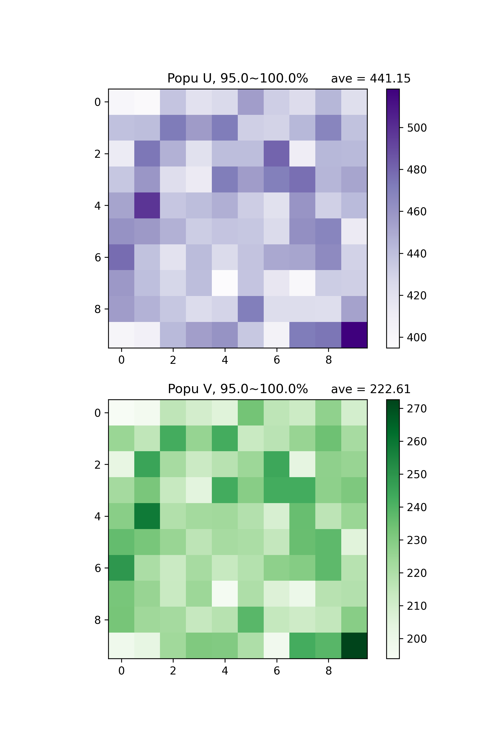
Distribution of U and V population at 95% ~ 100% maxtime
“95.0% ~ 100.0%” means we are making heatmaps with average data generated at the last 5% of maxtime.
This is interesting phenomenon: U, V start from uniform distribution, but ended up with clustering bahevior. We can also see how population distribution change over time directly by making videos:
videos.make_video(mod, 'UV_hmap', dirs = 'demo video')
./demo video. Check them out!save(mod, dirs = 'demo save')
./demo save.read_data:sim2 = load('demo save')
sim2 will be exactly the same as sim with the same parameters and data.
Here this short demo is coming to an end. We have shown how to set up a model and run simulations, basic figures and videos, and ways to save and read data. You can find more detailed examples in the documentation of every module.