piegy.figures
This section describes the figures module of our package: make figures to visualize simulation results.
We reserved the word “plot” for matplotlib plots, and use “figures” as the name of the module instead.
Dynamics Figures
This subsection contains the functions for plotting dynamics of certain values, i.e., how the values change over time, from time t = 0 to maxtime.
- figures.UV_dyna(mod, ax=None, interval=20)
- Plot population dynamics of the two species over time, specifically hawk’s population
U, doves’ populationV, and total populationU + V.- Parameters:
mod (
piegy.simulation.modelobject) – where the parameters of the model and data are stored.ax (matplotlib axes) – matplotlib axes to plot upon. A new axes will be created if
Noneis given.interval (int) – the function takes average over every
intervalmany data points and makes plot. Used to smooth curves. See details at Clarifications-interval
- Returns:
a plot of the change of population over time.
- Return type:
matplotlib axes.
- figures.pi_dyna(mod, ax=None, interval=20)
- Plot payoff dynamics of the two species over time, specifically hawk’s population
Hpi, doves’ populationVpi, and total populationHpi + Vpi.- Parameters:
mod (
piegy.simulation.modelobject) – where the parameters of the model and data are stored.ax (matplotlib axes) – matplotlib axes to plot upon. A new axes will be created if
Noneis given.interval (int) – the function takes average over every
intervalmany data points and makes plot. Used to smooth curves. See details at Clarifications-interval
- Returns:
a plot of the change of population over time.
- Return type:
matplotlib axes.
- figures.UV_std(mod, ax=None, interval=20)
- Plot dynamics of standard deviation of population over time.
- Parameters:
mod (
piegy.simulation.modelobject) – where the parameters of the model and data are stored.ax (matplotlib axes) – matplotlib axes to plot upon. A new axes will be created if
Noneis given.interval (int) – the function takes average over every
intervalmany data points and makes plot. Used to smooth curves. See details at Clarifications-interval
- Returns:
a plot of the change of population over time.
- Return type:
matplotlib axes.
- figures.pi_std(mod, ax=None, interval=20)
- Plot dynamics of standard deviation of payoff over time.
- Parameters:
mod (
piegy.simulation.modelobject) – where the parameters of the model and data are stored.ax (matplotlib axes) – matplotlib axes to plot upon. A new axes will be created if
Noneis given.interval (int) – the function takes average over every
intervalmany data points and makes plot. Used to smooth curves. See details at Clarifications-interval
- Returns:
a plot of the change of population over time.
- Return type:
matplotlib axes.
- figures.UV_hist(mod, ax_H=None, ax_D=None, color_H='purple', color_D='green', start=0.95, end=1.0)
Make two histograms of average population density in a specified time interval.
- Parameters:
mod (
piegy.simulation.modelobject) – where the parameters of the model and data are stored.ax_H (matplotlib axes) – matplotlib axes to plot the histogram of U upon. A new axes will be created if
Noneis given.ax_D (matplotlib axes) – matplotlib axes to plot the histogram of V upon. A new axes will be created if
Noneis given.color_H (str) – color for the histograms, using regular matplotlib colors.
color_D (str) – similar to
color_H.start (float or int, \(\le 1\)) – start of the time interval. Default 0.9 means the interval starts from 90% of maxtime.
end (float or int, \(\le 1\)) – end of the time interval. Default 1.0 means the interval ends at exactly maxtime. See details of
startandendat Clarifications-start-end.
- Returns:
two density histograms for U, V population.
- Return type:
matplotlib axes.
- figures.pi_hist(mod, ax_H=None, ax_D=None, color_H='purple', color_D='green', start=0.95, end=1.0)
Make two histograms of average payoff density in a specified time interval.
- Parameters:
mod (
piegy.simulation.modelobject) – where the parameters of the model and data are stored.ax_H (matplotlib axes) – matplotlib axes to plot the histogram of U payoff upon. A new axes will be created if
Noneis given.ax_D (matplotlib axes) – matplotlib axes to plot the histogram of V payoff upon. A new axes will be created if
Noneis given.color_H (str) – color for the histograms, using regular matplotlib colors.
color_D (str) – similar to
color_H.start (float or int, \(\le 1\)) – start of the time interval. Default 0.9 means the interval starts from 90% of maxtime.
end (float or int, \(\le 1\)) – end of the time interval. Default 1.0 means the interval ends at exactly maxtime. See details of
startandendat Clarifications-start-end.
- Returns:
two density histograms for U, V payoff.
- Return type:
matplotlib axes.
Distribution Figures
This subsection contains the distribution functions, i.e., the average distribution of either population or payoff in a specified time interval.
- figures.UV_heatmap(mod, ax_H=None, ax_D=None, color_H='Purples', color_D='Greens', start=0.95, end=1.0)
- Make two heatmaps for average population distributions of hawks and doves in a specified time interval.Intended for the 2D spatial setting, where both
NandMlarger than 1. For 1D space, please use UV_bar.- Parameters:
mod (
piegy.simulation.modelobject) – where the parameters of the model and data are stored.ax_H (matplotlib axes) – matplotlib axes to plot the heatmap of U population upon. A new axes will be created if
Noneis given.ax_D (matplotlib axes) – matplotlib axes to plot the heatmap of V population upon. A new axes will be created if
Noneis given.color_H (str) – color to use for U’s heatmap. Uses matplotlib color maps.
color_D (str) – similar to
color_H.start (float or int, \(\le 1\)) – start of the time interval. Default 0.9 means the interval starts from 90% of maxtime.
end (float or int, \(\le 1\)) – end of the time interval. Default 1.0 means the interval ends at exactly maxtime. See details of
startandendat Clarifications-start-end.
- Returns:
two heatmaps of distribution of U, V population.
- Return type:
matplotlib axes.
- figures.pi_heatmap(mod, ax_H=None, ax_D=None, color_H='Purples', color_D='Greens', start=0.95, end=1.0)
- Make two heatmaps for average payoff distributions of hawks and doves in a specified time interval.Recommend using different colors for population and payoff to avoid confusion.
- Parameters:
mod (
piegy.simulation.modelobject) – where the parameters of the model and data are stored.ax_H (matplotlib axes) – matplotlib axes to plot the heatmap of U payoff upon. A new axes will be created if
Noneis given.ax_D (matplotlib axes) – matplotlib axes to plot the heatmap of V payoff upon. A new axes will be created if
Noneis given.color_H (str) – color to use for U’s heatmap. Uses matplotlib color maps.
color_D (str) – similar to
color_H.
- Returns:
two heatmaps of distribution of U, V population.
- Return type:
matplotlib axes.
- figures.UV_bar(mod, ax_H=None, ax_D=None, color_H='purple', color_D='green', start=0.95, end=1.0)
- Make two heatmaps for average population distributions of hawks and doves in a specified time interval.Intended for 1D spatial setting, where
N= 1. For 2D space, please use UV_heatmap.- Parameters:
mod (
piegy.simulation.modelobject) – where the parameters of the model and data are stored.ax_H (matplotlib axes) – matplotlib axes to plot the heatmap of U payoff upon. A new axes will be created if
Noneis given.ax_D (matplotlib axes) – matplotlib axes to plot the heatmap of V payoff upon. A new axes will be created if
Noneis given.color_H (str) – color for the barplots. Note we are not making heatmaps, so please use regular colors rather than color maps.
color_D (str) – similar to
color_H.start (float or int, \(\le 1\)) – start of the time interval. Default 0.9 means the interval starts from 90% of maxtime.
end (float or int, \(\le 1\)) – end of the time interval. Default 1.0 means the interval ends at exactly maxtime. See details of
startandendat Clarifications-start-end.
- Returns:
two baplots of distribution of U, V population.
- Return type:
matplotlib axes.
- figures.pi_bar(mod, ax_H=None, ax_D=None, color_H='violet', color_D='yellowgreen', start=0.95, end=1.0)
- Make two heatmaps for average payoff distributions of hawks and doves in a specified time interval.Intended for 1D spatial setting, where
Nequal to 1. For 2D space, please use pi_heatmap.Recommend using different colors for population and payoff to avoid confusion.- Parameters:
mod (
piegy.simulation.modelobject) – where the parameters of the model and data are stored.ax_H (matplotlib axes) – matplotlib axes to plot the barplot of U population upon. A new axes will be created if
Noneis given.ax_D (matplotlib axes) – matplotlib axes to plot the barplot of V population upon. A new axes will be created if
Noneis given.color_H (str) – color for the barplots. Note we are not making heatmaps, so please use regular colors rather than color maps.
color_D (str) – similar to
color_H.start (float or int, \(\le 1\)) – start of the time interval. Default 0.9 means the interval starts from 90% of maxtime.
end (float or int, \(\le 1\)) – end of the time interval. Default 1.0 means the interval ends at exactly maxtime. See details of
startandendat Clarifications-start-end.
- Returns:
two baplots of distribution of U, V population.
- Return type:
matplotlib axes.
Other Functions
- figures.UV_pi(mod, ax_H=None, ax_D=None, color_H='violet', color_D='yellowgreen', alpha=0.25, start=0.95, end=1.0)
- Make a scatter plot for the correlation between average population and average payoff across a specified time interval.Every point denotes a patch, its x-coord is the patch’s population, y-coord is payoff.
- Parameters:
mod (
piegy.simulation.modelobject) – where the parameters of the model and data are stored.ax_H (matplotlib axes) – matplotlib axes to plot the corr plot of U population-payoff upon. A new axes will be created if
Noneis given.ax_D (matplotlib axes) – matplotlib axes to plot the corr plot of V population-payoff upon. A new axes will be created if
Noneis given.color_H (str) – color for the barplots. Note we are not making heatmaps, so please use regular colors rather than color maps.
color_D (str) – similar to
color_H.start (float or int, \(\le 1\)) – start of the time interval. Default 0.9 means the interval starts from 90% of maxtime.
end (float or int, \(\le 1\)) – end of the time interval. Default 1.0 means the interval ends at exactly maxtime. See details of
startandendat Clarifications-start-end.
- Returns:
two baplots of distribution of U, V population.
- Return type:
matplotlib axes.
- Returns:
two scatter plots for correlation between population and payoff, for U and V two species.
- Return type:
matplotlib axes.
- figures.UV_expected(mod, color_H='Purples', color_D='Greens')
- Calculate and plot expected population of every patch only based on payoff matrices, assuming no migration or any stochastic process. Handles both 1D and 2D case.For 2D, population is shown in heatmaps. And for 1D, uses barplots.
- Parameters:
mod (
piegy.simulation.modelobject) – where the parameters of the model and data are stored.color_H (str) – color for U’s plot. Please use matplotlib color map if your space is 2D, use regular colors if 1D.
color_D (str) – same as
color_H.
- Returns:
two heatmaps or barplots about the distribution of U, V expected population.
- Return type:
matplotlib figure
- figures.UV_expected_val(mod)
- Calculate expected U, V population based on payoff matrices, assuming no migration or any stochastic process.To differentiate from
peigy.figures.UV_expected, this funtion returns the exact values rather than figures.We recommend usingpeigy.figures.UV_expectedinstead for visualization purposes. Use this function if you want the exact values.- Parameters:
mod (
piegy.simulation.modelobject) – where the parameters of the model and data are stored.- Returns:
two 2D arrays containing the expected population at each patch.
- Return type:
numpy.ndarray
Examples
piegy.figures functions.piegy.simulation and piegy.figures modules:from piegy import simulation, figures
import matplotlib.pyplot as plt
piegy.simulation.get_demo function:mod = simulation.demo_model()
simulation.run(mod)
piegy.figures.UV_dyna function:fig_UV_dyna, ax_UV_dyna = plt.subplots()
figures.UV_dyna(mod, ax_UV_dyna, interval = 10)
interval = 10 means to take average over every 10 data points. See more at Clarifications-interval.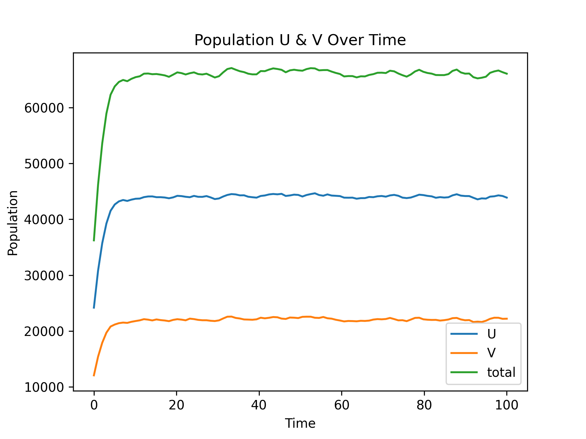
UV_dyna: Population Dynamics
piegy.figures.pi_dyna function:fig_pi_dyna, ax_pi_dyna = plt.subplots()
figures.pi_dyna(mod, ax_pi_dyna, interval = 10)
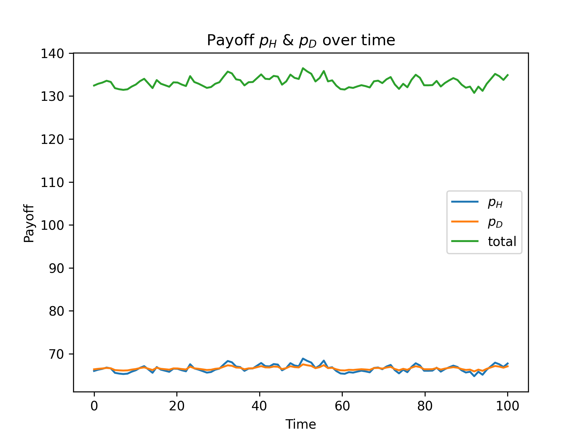
pi_dyna: Payoff Dynamics
interval value:fig_pi_dyna40, ax_pi_dyna40 = plt.subplots()
figures.pi_dyna(mod, ax_pi_dyna40, interval = 40)
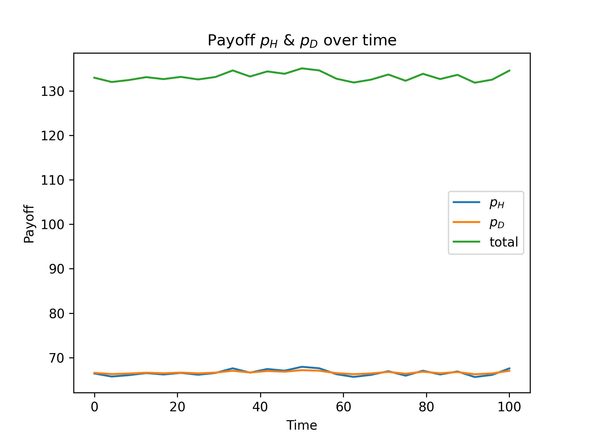
Smoother Payoff Dynamics with interval = 40
piegy.figures.UV_std and piegy.figures.pi_std.Let’s now look at distributions: the distribution of population and payoff in some certain time interval.
Call piegy.figures.UV_heatmap function:
fig_UV_hmap, ax_UV_hmap = plt.subplots(2, 1, figsize = (6.4, 9.6))
figures.UV_hmap(mod, ax_UV_hmap[0], ax_UV_hmap[1], start = 0.95, end = 1.0)
start = 0.95 and end = 1.0 means we are plotting the average distribution over 95% ~ 100% of total time, i.e., the end of simulation.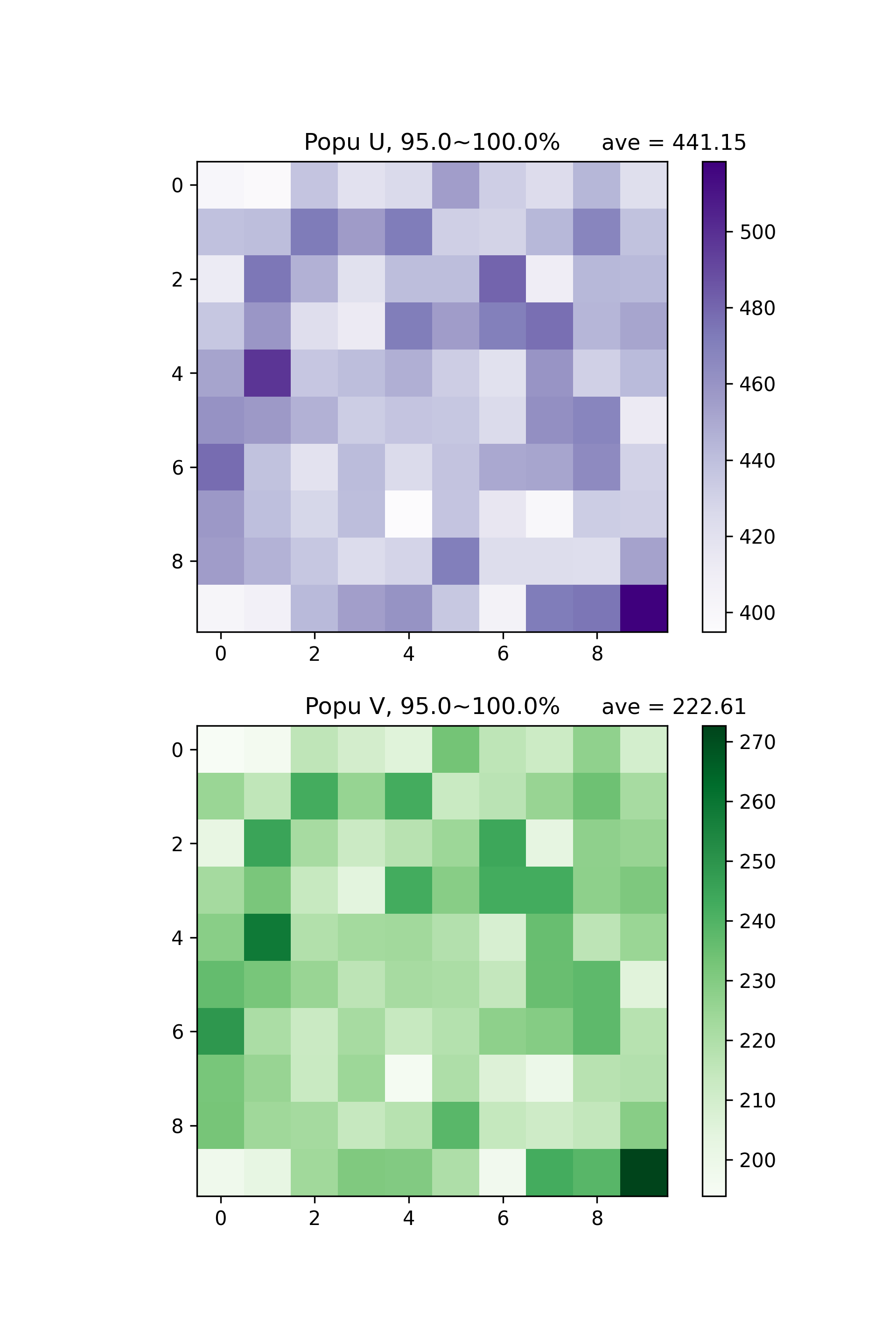
U & V population Distribution in 95% ~ 100% Total Time
start and end values.piegy.figures.pi_heatmap:fig_pi_hmap, ax_pi_hmap = plt.subplots(2, 1, figsize = (6.4, 9.6))
figures.pi_hmap(mod, ax_pi_hmap[0], ax_pi_hmap[1], start = 0.95, end = 1.0)
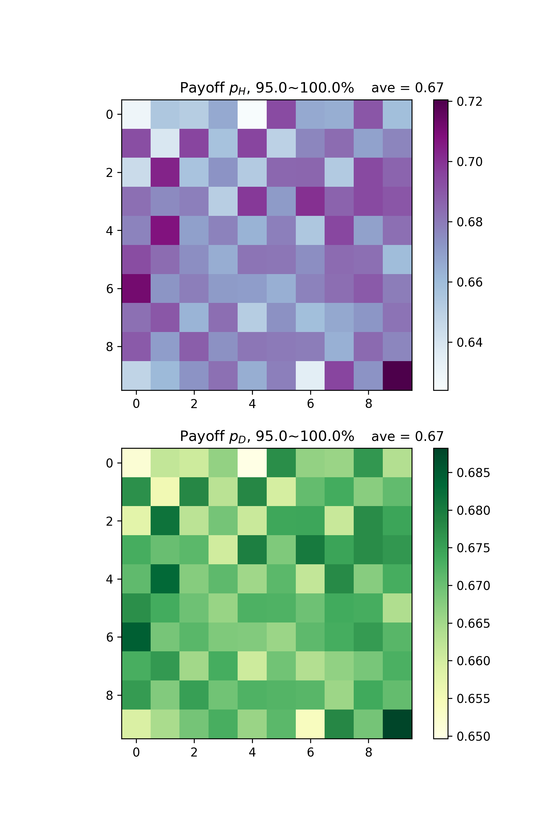
U & V Payoff Distribution in 95% ~ 100% Total Time
You may notice the correlation between population and payoff: patches with higher population tend to have higher payoff.
Let’s visualize the correlation with scatter plots. Call piegy.figures.UDpi:
fig_corr, ax_corr = plt.subplots(2, 1, figsize = (6.4, 9.6))
figures.UV_pi(mod, ax_corr[0], ax_corr[1], alpha = 0.5, start = 0.95, end = 1.0)
alpha is used to make points semi-transparent since there are lots of overlaps.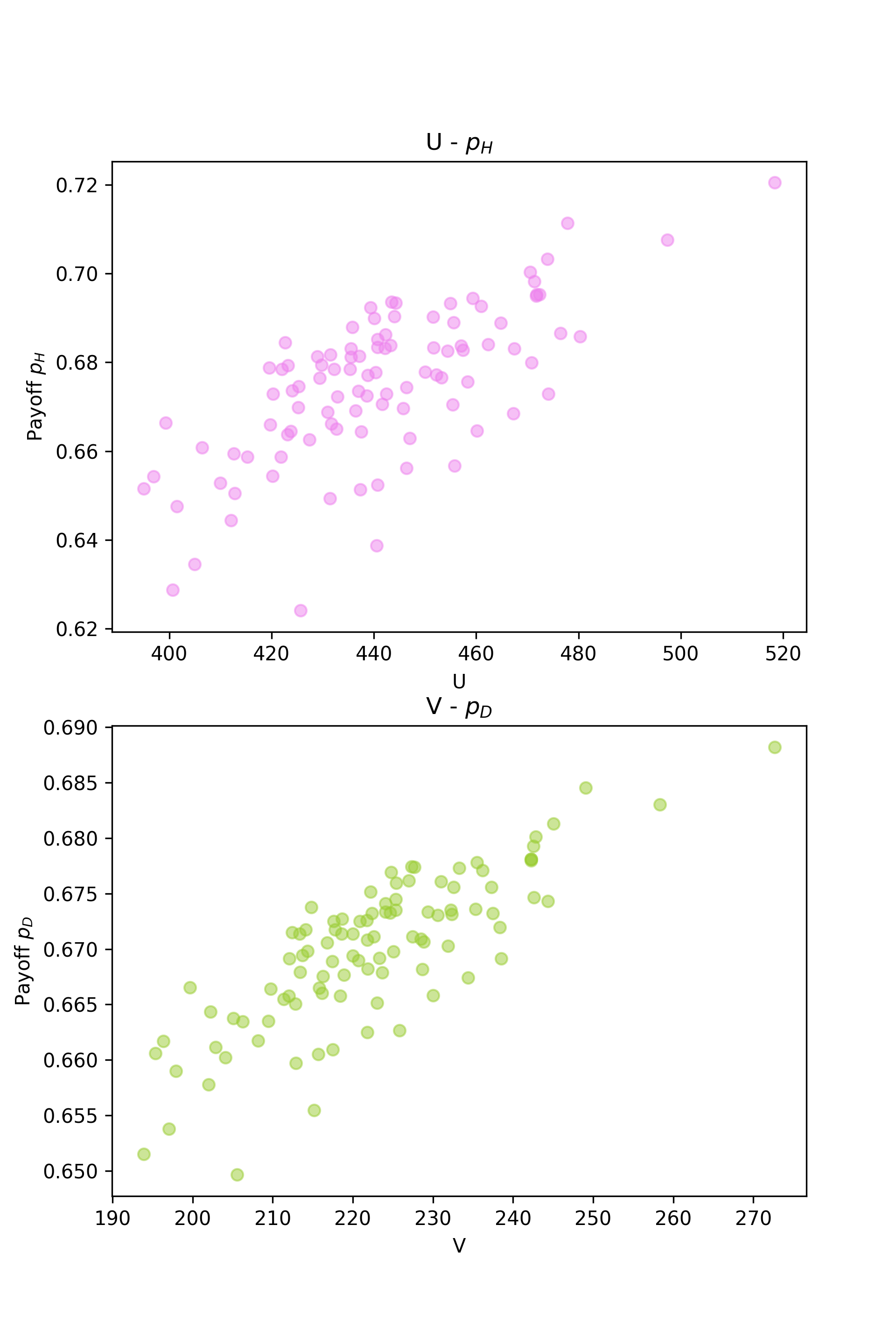
U and V Population - Payoff Correlation Plot
So far we have introduced most of our piegy.figures functions and basic usages. Explore the rest as well!